Hi Moderator. Here you will find all my posts from September including my firsts tasks, my research and planning for my music magazine and my evaluation, questions 1-7. I have layered out my blog so it is easy for you to read, understand and find posts.
I hope you enjoy scrolling through my blog.
Many thanks, Georgina.
Saturday, 9 May 2015

Friday, 8 May 2015
Evaluation Question 6
I used a lot of different technology products and software throughout the production of my magazine. They all helped me a lot with my magazine. Some I had used before and learnt more things on it. Some things I had never used before and throughout my production I learnt a lot of skills and improved largely.

Above is a Canon DSLR Camera. I had used one of these before so knew some of the features to use but there were many different ones on there and I hadn't used most of them so learnt how to use them a long the way. The camera helped me a lot with my model shots and the features helped me to get a perfect shot for my magazine.

Here i have shown how to use photoshop. How to add text and brighten up an image. I have also show how to use blogger on IShowU. I have shown how to compose text and insert an embedded code.
Evaluation Question 4

Her name is Lucy. She is 14 years old and is still at school (high school). Her favourite hobbies are dancing and singing. And she loves make-up and would love to know new make-up tips and what good make-up to buy. Lucy is at that age of where she needs to learn life tips, like make-up, relationships etc. She likes to wear fashionable clothes and has great style. She is into pop music and likes to sing songs by artists like Katy Perry, Justin Bieber and One Direction and dance to artists like that too. Her main goal in life is to become a singer so reading about the model used in my magazine who is a singer is perfect for her. All these combined Lucy is the perfect person to be reading magazines like mine.
Thursday, 7 May 2015
Evaluation Question 3

By clicking on the Flickr slide above, it will take direct you to my Flickr slideshow of where I have annotated my music magazine regarding distribution.
Evaluation: Question 2
Expression: As you can see both models are pulling the same facial expression. They are both smiling with a big grin. They show happiness and fun which relates to the magazine theme and audience. It will help attract a female audience, specifically a younger female audience aged 13-16.
Posture: The posture is near enough the same from both magazines though my model is slightly turned whereas the 'we love pop' model is facing the camera directly. This shows the female audience confidence from women.
Shot-type: Both models shots are close ups. I think this shows the female audience to be confident and not be afraid to get up close and personal.
Costume, Hair and Make-Up: Both models have their hair up. I think this once again shows the female audience confidence and show off their face and beauty and not hide it. Both models are wearing feminine colours which would attract the female audience. Also both wearing accessories which again will also attract the female audience. Both show natural beauty by wearing minimum make up which once again would give confidence to the female audience. As it is a close up you can't see much of the outfit but the slight bit you can, the make up, accessories and hair can still show a lot.
Overall both of my models have very similar facial features which also goes along with the similar posture alongside the feminine touches they both bring with colours, fashion etc. These are all qualities of my target audience for my music magazine.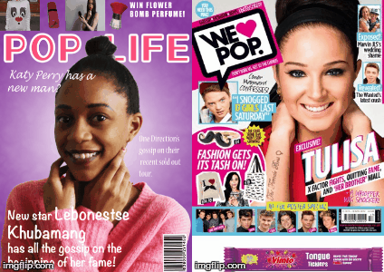
Posture: The posture is near enough the same from both magazines though my model is slightly turned whereas the 'we love pop' model is facing the camera directly. This shows the female audience confidence from women.
Shot-type: Both models shots are close ups. I think this shows the female audience to be confident and not be afraid to get up close and personal.
Costume, Hair and Make-Up: Both models have their hair up. I think this once again shows the female audience confidence and show off their face and beauty and not hide it. Both models are wearing feminine colours which would attract the female audience. Also both wearing accessories which again will also attract the female audience. Both show natural beauty by wearing minimum make up which once again would give confidence to the female audience. As it is a close up you can't see much of the outfit but the slight bit you can, the make up, accessories and hair can still show a lot.
Overall both of my models have very similar facial features which also goes along with the similar posture alongside the feminine touches they both bring with colours, fashion etc. These are all qualities of my target audience for my music magazine.
Wednesday, 6 May 2015
Friday, 10 April 2015


Contents Progression

I've started to add more images to my contents page so it looks more fuller and there's not a lot of empty spaces.
Contents Progression

Contents Progression

I've started to experiment with different colours on the titles of each page number so they stand out.
Contents Progression

This shows me using the spacing of the page so it doesn't look cramped. I've spaced out the writing so it's a lot easier to read.
Contents Progression

This shows the drop shadow being used on the images I've used and how you can see it makes the images stand out.
Contents Progression

This shows me using my tools and using a drop shadow on my contents page. This makes the pictures on my contents page stand out.
Contents Progression

As well as my front cover, I didn't like my contents page and decided to change the colours of that also. I've started to put different background colours in to, in a girly pink cover that matches my front cover along with the font being purple that also matches my front cover.


Subscribe to:
Posts (Atom)